
Non-Neutrals: SatinWood Seattle Blue & Yukon Green
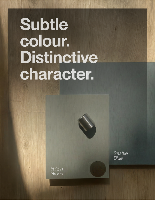
A softer approach to colour
Bring a fresh perspective to cabinetry with SatinWood Yukon Green and SatinWood Seattle Blue, two considered colours that offer an alternative to familiar neutrals.
With neutrals having dominated the trends for the past few years, it is refreshing to see the rise of non-neutral colours. With green and blue leading the non-neutral colour choices in the NKBA’s 2026 kitchen report, these tones speak to an appetite for colour that feels both expressive and easy to live with. Pair them with clean-lined cabinetry for a contemporary look with a little more character.
smoky slate blue
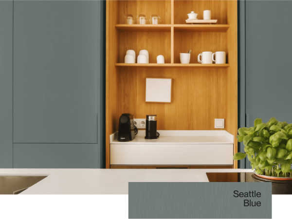
A medium-depth blue-green softened by a substantial grey undertone. It sits between slate, eucalyptus and muted teal rather than reading as navy or conventional blue. Its restrained linear grain gives the colour depth and material character, preventing it from becoming another flat grey.
pale lichen green
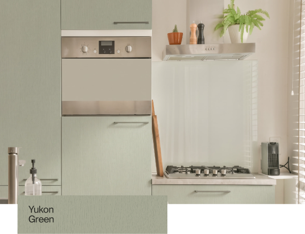
A soft, pale green with grey, khaki and stone undertones. It is closer to lichen, silvery sage or muted olive than mint. The fine, low-contrast woodgrain adds gentle movement without making the surface feel rustic. In warm light it will appear slightly greiger; under cooler light, its green undertone will become clearer.